New tools, old images
I’ve talked about revisiting old images before (see here) because I believe that as your digital darkroom tools and skills improve, you can breathe new life into older images as a way to upgrade the quality of your portfolio over time (note: if you aren’t someone who spends time learning new skills in image processing and thinks your current tools are fine, there’s a discussion we need to have, but… later. I’m looking at you, person who tells me Photoshop CS3 is perfectly fine).
Since I recently decided to adopt in some of the Topaz Labs tools — specifically their AI Sharpen and AI DeNoise tols — into my workflow, I’ve been evaluating how well they work and what images it makes sense to use them with. And, of course, how to build as simple and repeatable a workflow as possible. I’ve decided the answer to those questions is “I really like the results” and “every image I process”. The latter was not the answer I expected to choose when I started this, not in the least.
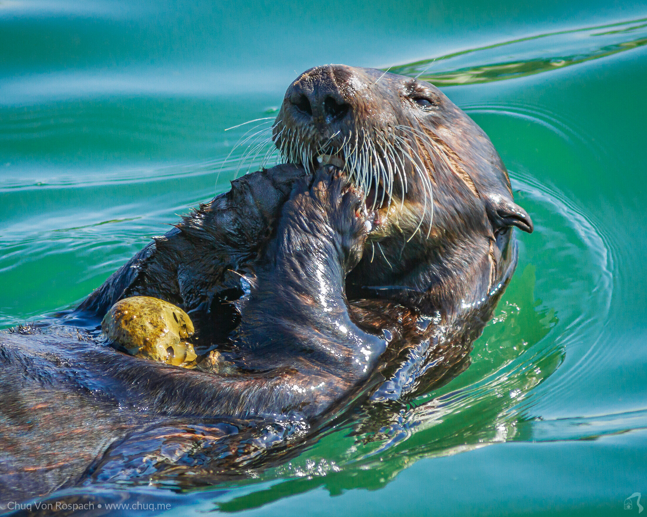
Starting to work with those tools also now has me looking at some of the images in my portfolio and thinking “oh, I can do better than that….”. And that has started a background project in updating some of my best images where my eye and ability are now showing me flaws. For instance, a pop quiz. When you look at this image, do you see a sea otter? Or Chromatic Aberration? For me, now, it’s the latter, so this shot needs some work. But not today…
Instead, when I start evaluating tools or new processing techniques, I always start with a specific image. It’s one I love — and which is technically a very flawed image. It’s from 2011 of a sunset over Morro Bay Harbor and the rock, taken with a canon 7d. I had finished dinner sitting at a window table in the Great American Fish restaurant on the harbor and enjoying the view when the sun started going behind the rock, and the skies exploded in light. I paid my bill, grabbed my gear and walked out onto one of the docks next to the restaurant and shot pictures for a while.
This is what came out of the camera:

Um, yeah. It’s a bit… underexposed. and other things. But what I saw I loved, and when I got home, I decided I could make something out of this shot. In 2011, processing tools were a lot less capable than they are today, and, to be honest, HDR was the hot new puppy, so my initial rendition involved a 3 image HDR followed by massaging in Lightroom, followed by hours of beating it with a stick in Photoshop until it more or less cooperated. The image that came out of that editing session looked like this:
This has been one of my more popular images and has been licensed multiple times, and borrowed often as well. It has problems, partly due to tools and operator flaws, but partly environmental — there was a fog bank off shore that is part of the problem you see with the banding and halos at the edge of the ground/air interface (note: PART of the problem. It was more my inability to fix that properly..)
I’ve taken shots and improving this image a number of times over the years. the most recent was a couple of years ago. Now, the HDR processing is gone, there is actually enough dynamic range in this image that it was never really necessary. But the tools have improved, to the point where this newer version could be done with Lightroom only and without the side trip into Photoshop, and took me about 15 minutes instead of 2+ hours.

I think it’s a nice improvement overall. I didn’t clone the common loons out this time, although I wish they were an inch or so further in from the edge. The fog bank is still there, and I didn’t fight it as much to get rid of it, so there are fewer processing artifacts, but I think that interrupts the golden tones more than I’d like. there are still artifacts at the air/ground interface but not ones you’re likely to see in an online copy. I must admit I don’t like the sun as much as the original, but I like the rest of the image more.
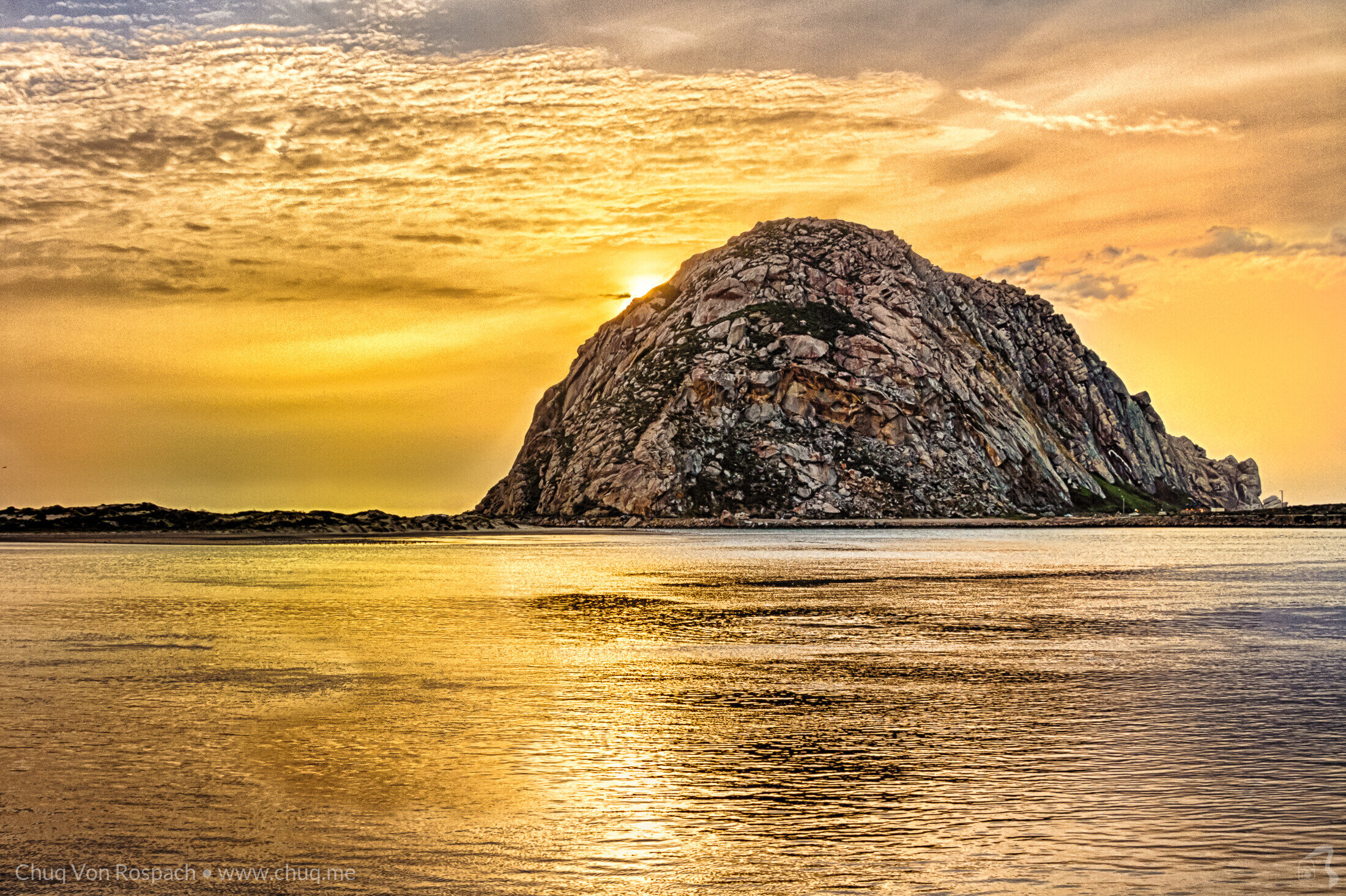
I was curious how Topaz AI Sharpen and Denoise would handle this, and so I started over, threw out all the processing and did it from scratch. A big difference with this version is a much more thoughtful use of radial filters with luminence masks and brush work, and I think I’ve worked out almost all of those edge artifacts this time. I also wonder why I never looked at it until now and said “ah. 16:9”.
So this is my new favorite version of this thing:

I really like the color and texture in the water and sky here, and while I still don’t love that sun, I think the texture in the clouds makes it work better. 16:9 fixes the compositional issues with the loons and really improves the image to my eye. It’s not perfect — it can never be perfect — and there are still some green color artifacts in that fog bank, but not things you can see in an online image, and not things I can see examining it printed out — but pixel peeping I can see them. It looks frankly pretty awesome at 8x10, and I’m hoping it’ll not break when I try 13x19 soon.
Much of the improvement in this new version is tied to skills I’ve learned in the last couple of years in figuring out ways to leverage some of Lightrooms newer tools like Radial masks. The topaz labs tools did their part — I’m sure you’re shocked that an image like this being brought out of that original RAW file is noisy, and the Sharpening AI tool did a nice job of managing sharpening in the water and rock while not creating sky artifacts, and the denoiser cleaned it up nicely while maintaining detail. I’m sold.
This one may well go up on my wall again.